What Is Color Analysis?
Color analysis is the practice of identifying which colors suit your natural coloring. Analysts consider temperature, depth or value, and saturation or chroma, observing how different colors affect the appearance of your complexion and features. In short, it gives you a practical framework for recognizing which colors flatter you the most. One of the most widely used modern approaches is the 12-season system, which expands the traditional four seasons — Spring, Summer, Autumn, and Winter — into three sub-seasons within each family; the sections below explore each one in detail.
Why the Right Color Changes Everything
When you wear a color that works well with your natural coloring, you may notice that your complexion appears clearer, your features look more defined, and the overall effect feels balanced. Less flattering shades can sometimes emphasize redness, shadows, sallowness, or unevenness, although the effect varies from person to person.
That is what color analysis gives you. It explains why certain pieces in your closet always feel right while others never get worn. Once you understand your color season, getting dressed becomes intentional. You reach for the pieces that genuinely make you look and feel your best, and you build a wardrobe that helps you get dressed with more confidence.
The payoff is practical as much as personal. When you know your palette, shopping can become faster because you have a clearer filter for evaluating color. You may buy fewer pieces that go unworn, reducing costly mistakes and unnecessary closet clutter. When much of your wardrobe draws from a coordinated palette, pieces are also more likely to mix and match easily, allowing a smaller, more considered wardrobe to stretch further. Over time, that can create a closet that feels cohesive instead of scattered and a morning routine that requires less second-guessing.
A Brief History of Color Analysis
The seasonal approach to color has roots that stretch back further than many people realize. Twentieth-century color theorists and image consultants developed ideas about coordinating personal coloring with specific color palettes. The concept reached a broad mainstream audience in 1980, when Carole Jackson's book Color Me Beautiful popularized a four-season framework of Spring, Summer, Autumn, and Winter.
The original system introduced seasonal color analysis to a wide audience. As the field evolved, some practitioners considered the four-season framework too broad for people whose coloring did not fit neatly within one traditional category. Expanded systems, including the 12-season framework, were developed to add more nuance within each seasonal family.
Terminology and methodology vary between systems, but most consider some combination of temperature, depth or value, and chroma, saturation, or clarity.
How Seasonal Color Analysis Works
Across seasonal color-analysis frameworks, results are generally assessed through three broad properties of your natural coloring.
Temperature describes whether your coloring appears warmer, cooler, or more neutral. Warm coloring tends to show golden or peachy qualities, while cool coloring appears pinker, rosier, or more blue-based. Olive skin can be warm, cool, or neutral, so it should not be treated as automatically warm. Temperature helps point toward the warmer Spring and Autumn families or the cooler Summer and Winter families.
Depth, also called value, describes how light or dark your overall coloring appears. Depth helps distinguish lighter palettes from deeper ones and contributes to identifying the seasonal variation that creates the most balanced effect.
Saturation, often called chroma or clarity, describes how bright and pure or soft and muted your overall coloring appears. Some people are flattered by vivid, high-chroma colors, while others look their best in blended or softened shades.
No single property determines a season on its own. Temperature alone cannot distinguish Spring from Autumn or Summer from Winter. Analysts consider the interaction of temperature, depth, and chroma, along with the visible effect created when colors are compared against the face.
Popular Color Analysis Systems
You will come across a few different frameworks, and it helps to know how they relate. The classic four-season system, the one popularized by Color Me Beautiful, sorts everyone into Spring, Summer, Autumn, and Winter. Some well-known consultancies, including House of Colour, still work primarily from this four-season foundation before refining toward your best individual shades.
The 12-season framework builds on those same four families, dividing each into three variations to capture differences in temperature, depth, and clarity that broader categories may miss. Other expanded systems also exist, and their season names, boundaries, and methods may differ.
Although systems use different terminology and may weigh characteristics differently, a four-season result can provide a useful starting point. A 12-season analysis adds another layer by identifying which variation within that seasonal family best reflects your dominant coloring characteristics. Knowing that you are an Autumn, for example, does not by itself determine whether Soft, True, or Dark Autumn is your closest match.
The Four Seasonal Families & Their 12 Sub-Seasons
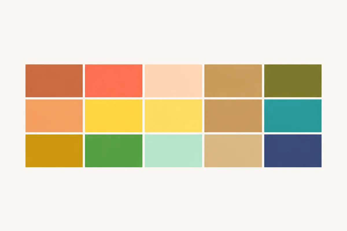
In the 12-season framework, each of the four main families of Spring, Summer, Autumn, and Winter contains three variations. Every family shares a general character. Spring is warm and fresh, Summer is cool and softened, Autumn is warm and rich, and Winter is cool and clear. The three sub-seasons within each family capture additional differences in temperature, depth, and chroma.
The Spring Family: Warm and Clear
If you are a Spring, your natural coloring carries warmth and clarity. Spring palettes are fresh, bright, and warm.
Yours is the lightest and most delicate Spring palette. Your colors are gentler than those of True or Bright Spring but still keep Spring's warmth and freshness rather than looking heavily muted or gray. Soft yellows, pale warm greens, and peachy pinks bring out your best. Lightness is your main consideration, so your colors should stay airy enough not to overpower your coloring.
Your colors are distinctly warm without being muted and clear without becoming icy. Think golden browns, warm peaches, sunny yellows, and fresh yellow-based greens. You come alive in bright coral and warm reds. Your neutrals lean toward warm camel, golden brown, and warm ivory.
You have the clearest, most vivid coloring in the Spring family, and often more contrast than other Springs. Your palette is energetic: think poppy red, warm hot pink, vivid green, bright yellow, and electric teal. Keep your colors clear rather than dusty or heavily muted. Because Bright Spring borders Bright Winter, you may handle stronger dark neutrals and crisper light neutrals than other Springs.
The Summer Family: Cool and Muted
If you are a Summer, your undertones are cool and your coloring is generally softer and more muted. Summer palettes feel calm, cool, and sophisticated, more like a soft overcast day than bright sunlight.
Your palette is airy, cool, and gently softened, with baby blue, pale rose, light lavender, cool pink, and soft mauve. Your neutrals include light gray, soft navy, and cool or neutral beige. Very dark or highly saturated colors can overwhelm your delicate coloring. Yours is a palette of quiet elegance.
Your colors are distinctly cool and moderately softened, including dusty rose, cool pink, mauve, periwinkle, slate blue, soft teal, and blue-green sage. Your neutrals include cool gray, cool taupe, and soft navy. You are not limited to pale shades. You can also wear richer cool colors such as raspberry, berry, and softened fuchsia, as long as they stay less intense than Winter brights.
Yours is the most muted and blended palette in the Summer family. Your colors look softened or slightly grayed, from dusty rose and cool taupe to muted teal, dusty lavender, and soft gray-blue. Your neutrals include soft gray, mushroom, greige, cool taupe, and muted beige. Very bright or highly saturated colors tend to overpower your coloring.
The Autumn Family: Warm and Earthy
If you are an Autumn, your coloring is warm with a beautifully muted, natural quality. Autumn palettes feel earthy, rich, and grounded.
Your colors stay muted and warm but never too bold. Think dusty peach, soft terracotta, warm olive, sage green, dusty gold, and muted teal. You look gorgeous in warm neutrals like camel, warm taupe, and warm beige. Bright colors overpower you, so your coloring shows best in refined, warm, muted tones.
You are balanced within the Autumn family and distinctly warm. Your colors are warm and rich, including terracotta, rust, golden mustard, olive green, warm teal, burnt orange, and warm burgundy. Your neutrals include camel, golden brown, warm khaki, and bronze. You can wear deeper, richer versions of warm colors while still looking grounded and balanced.
Yours is the deepest, richest palette in the Autumn family. It leans into deep, warm, sophisticated tones such as deep rust, warm burgundy, dark olive, deep bronze, and rich brown. Your neutrals include dark camel, bronze, warm taupe, and espresso. You can carry deep, saturated colors beautifully when they keep their warmth rather than turning cool or blue-based.
The Winter Family: Cool and Clear
If you are a Winter, your undertones are cool and your coloring is clear, often with high contrast. Winter palettes are crisp, sharp, and jewel-toned, with boldness and clarity as their signature.
Yours is the most vivid palette in the Winter family, usually with very high contrast. Your colors are intense and cool or neutral-cool, including hot pink, electric purple, bright red, cobalt blue, vivid green, and electric yellow. You can wear bold, highly saturated colors without being overwhelmed.
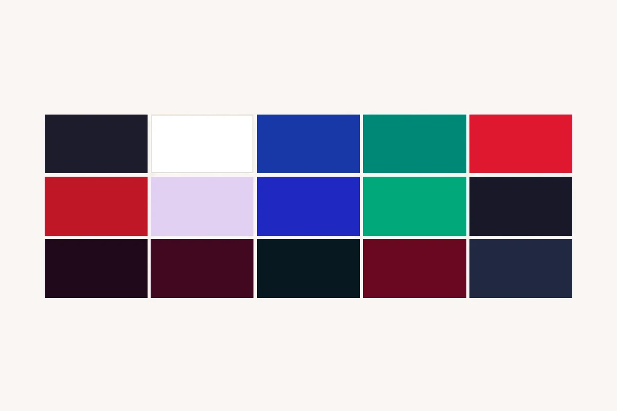
You are balanced among the Winter family. Your colors are cool and clear, from true red and fuchsia to true blue, sapphire, emerald, and bright teal. Your neutrals are black, true navy, charcoal, and pure white. You have enough contrast to wear both black and white, and they both feel right.
You have deep, rich coloring with cool or neutral-cool undertones and strong contrast. Your palette is bold and cool-leaning, including cool wine, deep plum, true navy, deep teal, emerald, and other dark jewel tones. You often look striking in black. Your neutrals include black, charcoal, true navy, and cool white. Very pale, dusty pastels can look disconnected from your depth, while icy or more saturated light shades usually create better harmony.
How to Discover Your Color Season
Now that you understand the 12-season framework, you might be wondering how to figure out which one is yours. There are several ways to do it, each with a different level of depth and investment.
Professional Color Analysis by Draping
For the most detailed professional assessment, in-person draping is generally considered the preferred method among color-analysis practitioners. The analyst seats you near a source of balanced natural daylight and compares fabric drapes representing different temperatures, values, and chroma levels against your skin. During each comparison, the analyst observes whether the color creates a clearer, more balanced complexion or emphasizes shadows, redness, sallowness, or unevenness.
The analyst looks for repeated positive effects across multiple comparisons rather than relying on one flattering shade. Through that process, they assess temperature, depth, and chroma and identify the palette that creates the most consistently balanced result.
Professional analysis often costs roughly $150 to $500 or more and may take a couple of hours. These are broad estimates: pricing and session length vary by location, the analyst's experience, the system used, and what is included. Physical swatches, makeup guidance, style consultation, or follow-up support can be part of the experience as well.
Virtual Color Analysis
Many trained consultants offer virtual color analysis. These sessions come in two formats. One is a live video call where the analyst walks you through the process in real time. The other is a photo-based review, where you submit a set of requested photos in natural lighting, or a combination of the two.
Virtual analysis can often be more affordable than in-person draping, although current professional services range from under $100 to several hundred dollars depending on the analyst and what is included. A carefully conducted virtual analysis can offer substantially more nuance than a self-guided quiz, but camera processing, lighting, white balance, and screen reproduction introduce variables that are not present during controlled in-person draping.
Online & At-Home Methods
Not everyone has access to a professional analyst, or wants to invest that time and money upfront. A few at-home approaches can help you form an initial hypothesis, as long as you treat them as casual clues.
Take a quiz. Online color-season quizzes ask questions about your natural coloring and color preferences, then use your answers to suggest a likely season. Quizzes are fast, low-cost, and useful as a starting point. You can try our color-season quiz, which takes about three minutes. Quizzes rely on self-reported traits and simplified logic, so treat the result as guidance rather than a definitive analysis.
Look at what already works. Review photos of yourself in different colors and notice repeated patterns. Do warmer or cooler shades make your complexion look more even? Do clear colors look energizing, or do softer shades create better balance? This is informal and can be affected by lighting, makeup, camera processing, and personal preference, but it can help you develop an initial hypothesis to test more carefully.
Notice a few undertone clues. Some quick observations can add context. The vein test, which reads green-looking veins as warm and blue-looking veins as cool, is popular but unreliable on its own, since lighting and skin depth change what you see, so weight it lightly. Comparing metals can offer a hint: if gold consistently gives you a clearer, more even complexion while silver adds shadow, or the reverse, that is a small clue, though many people wear both well. Your natural hair and eye color also give context for your overall depth and contrast, even though people with similar features can land in different seasons. None of these decide your season on their own. They simply help you form a guess to test against real colors under consistent, neutral lighting.